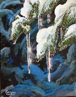
This is a very instructive and detailed
tutorial of one of the great painter,
Lorraine Vatcher's exceptional artworks.
The artist describes in many details the paint, the brushes and the technique as well, she used in the
painting process.
I consider, this tutorial is a great help for many beginner painters (like myself) and asked the artist's permission to publish it on my site. I hope you will enjoy it the way I did.
Have a great time reading and painting!

Nature’s Decorations -16x20 Acrylic on canvas
The picture I am using for a reference was one I took on a beautiful sunny day after a white blanket had covered our world and made it into a Winter Wonderland. Even though it was still cold, the sun had enough strength to start melting the snow on the branches of the spruce trees. As the water fell off the twigs, it froze into solid icicles which glinted in the sun; then the sun split the light into colors of the rainbow when you looked directly into the sun through the icicles.
I truly hope you enjoy this lesson. It really is more of a still life than scenery. I wanted to do something which isn’t a normal lesson. You can change placement of anything if you wish to make it more your own.
For those who attempt it, I would enjoy seeing the finished product so if you don’t mind, I would really appreciate an image of your finished product.

First, we will block in shapes of the
background which will resemble branches of a spruce tree with snow on them. Mix Windsor Blue with Titanium White in varying dark tones. Do not make them bright because we want the icicle to shine, not the background.With a 1” blending brush, block in these colors in general shapes, fairly linear to resemble the look of snow gathered on branches.
Then do the same with Payne’s Grey mixed with Titanium White in varying tones. The medium tones should be minimal. A light coat of Chrome Oxide Green in a few places gives the illusion of the under branches barely showing. Keep it muted with no real shapes and no light colors; nothing in this entire layer should pop out at you. Remember that the icicles are the
focal point. They have to be much brighter than the background.

Block in the shapes of the snow on the foreground branches with Titanium White. Keep composition in mind. Too much white will detract; we want this snow and the icicle to sparkle over the top of the background. Think about where the icicles will hang and how long. Paint them in. Keep the amount of icicles in odd numbers. Block them in.

Use Windsor Blue mixed with white to give shadows in the snow on the branches. In the darkest areas, add just a hint of Payne’s Grey mixed in with the blue. Tops of the snow are always pure white with the bright sun shining on them.

Change to a liner brush to stoke in the buds at the end of the twigs with Burnt Sienna mixed with Cadmium red. Also, with the liner brush, stroke in the needles from the branches which hang down into the dark background area with titanium white. This will give you a place to paint your green needles. It would be of no use to just stroke them in greens because the color would be drowned out by the dark background.
Many colors are transparent or semi-transparent so the surface has to be prepared to accept another color, otherwise it will have no impact.

Use three shades of green (Sap Green, Hooker’s Green and Chrome Oxide Green) and a liner brush to put in the needles of the branches. For the darkest green, mix Hooker’s Green with Cadmium Red in small amounts. This will make a much darker green. Stroke the needles in different colors. Keeping them the one color would be boring, also sometimes vary the direction because Nature does not always make them go in the same direction. Don’t forget to stroke over most but not all of the white needles hanging off the twigs into the dark background. There will be white highlight in some of the needles because that is where the sun will be hitting and reflecting. Stroke in the needles which are on the areas of white snow. You have already prepared for these because the background of white will readily accept the green colors and show very well.

With a small round brush, very lightly place a small amount of Cadmium yellow mixed with Titanium White in places on the snow to give a sparkle to the snow as if the sun is bouncing off the surface. In the areas close to the needles, add a small amount of Chrome Oxide Green mixed with white. The green simulates the green from the twigs under the snow as showing through. Although the snow is newly fallen, the hot sun is melting it and turning it to icy pellets in areas close to the twigs. This ice will reflect what is underneath it, namely the green of the twigs.
Ensure that your icicles are pure white before you start to color them in. Then with a small round brush, brush Payne’s Grey in areas down the length of the icicle. Do the same thing again with a mixture of Payne’s Grey mixed with Titanium White. And repeat it in small spots with Windsor Blue with Titanium White. The outside edges down the length should be bright white.

Next, very sparingly, spot Cadmium Yellow, Cadmium Red and Diazinon Purple. These colors will give the same idea as when a light hits a piece of glass or crystal; the light splits into differing colors. A very little bit of
paint will convey the idea.
The sparkles are created in two stages. The first is with a wash of Titanium White. The washes should be with very little color and a number 4 round brush. A number of washes is much better than one solid. Start in the center of the sparkle and pull the brush out to a point. Next, use Cadmium Red, Cadmium Yellow and Diazinon Purple in the same way, although sparingly. After the washes, hit very lightly with a hint of pure color.The small red buds which are hanging at the end of the twigs now get a bit of water hanging from them. Use a liner brush with a little Titanium white to outline the drop. Then fill it in with Payne’s Grey and just touch them with a color in the background which is around them. Water reflects its surroundings.With a liner brush dot the snow in lines where the needles will be peeking out of the snow. In real life, as the snow melts, more will be visible.


This tutorial is copyright Lorraine Vatcher.
Credits:
Originally it was published on
Creative Spotlite, where there are many other tutorials to enjoy.


