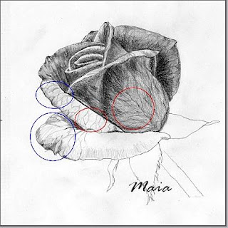
Last time we've created a two dimensional drawing (width, height), by outlining the visible edges of the rose. For this rose to look realistic we have to create a (false) third dimension: depth of field.
We can accomplish this by several techniques; by hatching, shading, combining these two and for even more interest, with texture drawing and cross contour drawing.
I don't give any indications on how to hold your pencil or how to alternate H pencils with soft B pencils. The simple fact that you are here means that you are motivated to find intuitively the right way you feel comfortable with. Still there are some important things to take in consideration when shading the rose.
Tips for shading a rose.
1. Value-the lightness or darkness of tones, is the tool for creating a convincing illusion of three-dimensionality, the realistic effect.When shading, we have to switch from linear drawing to value drawing focusing on areas of value.
Observe the dark and light areas on the petals and in different parts of the rose, also shadows and highlights.
Be aware of the optical effect of tonal value:
- light areas come forth, dark areas retract. It is easy to remember: light pushes dark back. Isn't that always true? Value in conjunction with contrast is what makes the rose pop out of the two-dimensional paper sheet.
-highlighted contour lines are fine lines and lines in shadow are heavier lines.

2. Line direction: by shading or hatching we should create a shaded surface that follows the three-dimensional form of the petals. Am I too abstract?
I'll explain that: a rose petal has the form of a circle (let's pretend); shading and hatch lines have to follow a radial direction, originating from the body of the rose ( see the red guide lines on the first image).
Each petal has a different position in space, so the line direction of shading-hatching changes accordingly to the petal's position.
Shading the rose
Step 1. Start with the darkest area of each petal near the body of the flower using a soft pencil. Keep the shading lighter at first.Work your way from the center to the outer edges of the flower petals, lighten the shading toward the edges.
Apply the tone with small sideways movement of the hand in the direction mentioned above.
Continue to shade the hole rose drawing.

Step 2. increase contrast.
After applying a middle tone on the hole surface, begin to darken the very darkest shadows even more, increasing contrast. The darkest shading is at the base of the petals and between petals.
It is impossible to get values right the first time you draw, so be patient and adjust your drawing observing your reference.As you progress, the contour lines should not be visible any more but the edges of adjoining areas of light and dark tones. Line is just a convention, it does not exist on the real rose. There is only the contrasting boundary between light and dark areas that forms the line.
Step 3. Blending
For a smooth surface you might like to try using a paper stump to blend tones but be careful, it can destroy all your work.
Cut a small piece of eraser to have a sharp edge and lift up highlights at the edges of the petals.

Step 4. Applying texture - add more interest.
Opposed to the soft look of the petals, to create a more powerful expression of the rose, add some texture (partially), to indicate the veins in the petals in a few places. See the red marks on the image.
Step 5. Cross - contour lines.
For even more interest add some hints of cross-contour to suggest the petals' form and bending (marked with blue on image 2 and 3).
This is the most interesting part as you don't have to draw much. Just indicate the direction with these cross contour lines and the brain fills in the rest of the information.

Step 6. Finishing the shading - drawing. Shade the sepals and darken the shadow edge of the stem observing where the shadow parts fall on the reference photo or on a real model.
Now step back and look at your beautiful rose drawing. Don't forget to sign it.
Sometimes it can happen that you are not quite pleased with the outcome but you can't figur out what is wrong with the drawing. It is more a feeling than seeing.
In this case put your drawing away and come back to it the next day. Than you will see it more objectively, like it would be someone else's work and you will find more easily the part that has to be adjusted.
See some more examples of shading.
4 comments:
Magnifique, merci de ce cours, tu es une grande artiste. C'est tres bien expliquer.Bravo Maia
Bon WE à toi Bye
Hi,
I am interested in sketching but never got an opportunity to learn from a teacher. I do it how it comes to me. But your website is really really wonderful. I have never came across any website like this. I want to know some details regarding sketching technique. Which is the best way to contact you ?
Thank you bhupinder kaur, you are too kind.
Unfortunately I don't have the time to write more tutorials at the moment but you can find many useful stuff about drawing at this site.
If you still want to contact me, please use the contact form at the bottom menu of any page.
Have fun!
Thank you. I like very much.
Post a Comment
Thanks for visiting.
Hope you enjoy the rest of the pages too.
We all love comments, so I am looking forward to visit you back.